
UI/UX
Choosing The Right Colors For Your Mobile App
Posted by: Digital Awesome
August 31, 2022
Just a few weeks ago, I picked up a Macbook Air and Apple had me choose between Gold, Space Grey and Silver. I didn’t have any particular preference coming into the store so I had to decide on the spot. Gold was an obvious choice for me as I’m naturally drawn to feminine hues. But the two other options had me thinking.
Space grey conveyed a sleek, high-tech vibe while the silver one spoke ‘timeless’ to me - both of which fit my workplace vision. My thought process involved a battle between personal preference and how I envisioned my workspace to look. In case you’re curious, I’m gunning for a more masculine one, think Star Wars vibe for this season.
Conflicted as I was, I ended up buying the gold laptop for myself. It won the mind game despite all my considerations for the two other options. Its metallic pink enclosure reflected the right amount of femininity with high-tech sensibilities so I settled with that one. While I wish I could just buy all of them so I can just switch them up as often as I change clothes, I only needed one device at that time. Moments like this showed the true power of colors. They not only make us feel something, but it also plays an enormous role in our purchasing decisions.
A survey shows that 92.6% of people believe that the visual dimension is the top influencing factor affecting their purchase. It is natural for people to make a subconscious judgement about a product within 90 seconds of the first glance. The same goes for when we’re choosing mobile apps to download and deciding which apps we end up using every day.
Colors convey moods which reflect human emotions, desires, aspirations and other meaningful associations. They also inspire actions and reflect a brand’s purpose. In app design, color scheming requires careful thinking and testing along the way because it can make or break a design and impact a user’s overall experience.
Say you have a mobile solution to help connect homeowners to a local recycling facility, having pink as your app’s dominant color seems off ain’t it? When we’re thinking about sustainability, green comes to mind won’t you agree? We are more receptive to this suggestion because it is human nature to subconsciously associate being environment-friendly with the color of nature and the earth. Our minds are conditioned to think that way unless we intentionally go the other way for a more unique approach. Either way, there’s science involved in all this.
Color psychology is a handy tool for those looking to launch a well-designed digital product. App icons and an app’s user interface should provide clarity, convey the app’s purpose and be visually appealing enough to pique the interest of prospective users. And this can be achieved by choosing the right hues to represent your brand.
The Color Studies
Let’s dive into the psychology of color in design and what each member of the spectrum represents.

Red is a classic. It’s eye-catching, suggests action and is known to be one of the chief advertising colors. It stimulates appetite or desire making it the perfect hue for food and other consumer brands.
One study conducted by HubSpot concluded that red performed relatively well in the aspect of conversion. The A/B button testing was done to see which call to action button would work best for a sales page. Red or Green. While the color green signified “go” or action, results actually showed that the red CTA button outperformed its competition by 21%. Red is a sure stunner in its own right but success is not guaranteed. Knowing your target market really well along with serious color testing would help you find your sweet spot when optimizing your design.
Here are some UI designs donning a crimson look:

Delinute Express on Dribbble

Motivational App on Dribbble

Using blue in your design can make users feel calm and confident. Incorporating it into the UI design shows dependability, efficiency and professionalism. It cultivates trust in you and your services. Its cool and collected demeanor is perfect for utility apps for IoT products, corporate apps and even healthcare apps to name a few.
Take caution though, blue can evoke negative emotions too. Depending on the shade you’ve chosen, it can also express sadness which can adversely affect brand perception and overall user experience.

Centurion App on Behance
Cloud Home on Behance

The future looks bright with yellow. Often used for road signages, yellow is the easiest color to spot. It provides a good contrast to texts and evokes feelings of optimism and happiness which gives people positive experiences.
Just like the color blue, it can take a bad turn when the wrong shade is used. The wrong shade of yellow can make a brand or product look cheap. Make sure to test your colors and see how your target market responds to them so you can decide on their appropriateness and effectiveness.
 Recipe search mobile app on Behance
 Grocery list sorting app on Behance

Green is a cure for eyesores. If you’re looking to drop a mobile app relating to nature, veganism, sustainability, growth and money, incorporating this color into your palette would seal the deal for sure. Its lush pigmentation relaxes the eye and evokes feelings of altruism and friendliness to both humans and nature.

Handprint App on Behance
 DXH Approach App on Behance

Traditionally, pink connotes sensitivity and playfulness. It is often used to support women’s causes and target a pool of female audiences due to its natural reception among the ladies. However, tides are now changing and pink now represents a more rebellious front.

Recipe app on Behance

Peony Finance UI on Behance

This citrus hue represents a myriad of energetic sentiments. It’s a striking visual that is both vibrant and mellow at the same time. Rightly so as this is rooted in the mixture of red and yellow which conveys both characteristics. This color has an interesting history as well. Before the 15th century, it was referred to as “yellow-red” and it was only after 1915 that it was related to the fruit.
Orange is ideal for food-related apps or any application that wishes to stimulate appetite because of its correlation to spices and select vegetables. Moreover, studies show that it also works well in conveying “good value” which is apt for brands that sell low-cost yet quality products like Dunkin Donuts and Home Depot.

Babil App on Behance

Nectarine App on Behance

We’ve been seeing a lot of this in UI design. The rise of minimalism as a way of living and a design trend paved the way for its popularity. It is a versatile choice for brands looking to develop apps focused on mindfulness, wellness, and productivity.
It can provide your design with a clean canvas where content and functionalities can be delivered with ease. On the other hand, black can give your minimalist look a more masculine touch. Using black in a design conveys strength, power and a defined presence overall.

Fitness App Keep on Behance

Crypto App on Behance
Related:
How To Choose The Right Mobile App Colors
There’s a myriad of colors and combinations out there so it’s impossible to pinpoint which one would work best for your app on this guide alone.
Choosing mobile app colors for your design requires a deep understanding of your brand and your target market. Factors like gender, age, preferences, interests and behavior can impact conversion and overall success. So A/B testing across all branding strategies may come as a surefire way to get a feel of your market.
The Sweet Spot
Creating a sensible color scheme is vital to your development process. Following a timeless color theory called 60:30:10 is a simple way for business owners and designers to come up with a well-balanced scheme for their brand.
The general rule is your dominant color should represent 60% of your design, supplementary colors will cover 30% and design accents like buttons should cover 10%. It is an incredibly simple concept to use during your brainstorming sessions. Keep the color combinations short and sweet with just 3-4 selections per study so you can streamline your selections. Try matching non-complementary colors with white or blacks and see your brand stand out from the rest. Moreover, questions like the ones below can help you determine your choices:
- Does this color represent our brand’s energy?
- What emotions do I associate this color with?
- Will this color convey our brand mission or the message we want to convey?
- Is it too conventional or is our target market more receptive to new-age visuals?
- Do these colors play well with all the visual elements in place?
- Does this color combination elevate or downplay our brand?
- Will these colors appeal to our target market based on their age, gender, interests and consumer behavior?
Color combinations can make or break a company’s branding so make sure to set feedback mechanisms along the way. While it is daunting to deal with this all on your own, design experts are there to lend a helping hand and ensure your app’s success.
Digital Awesome can help you explore the best color combinations for your mobile app and actually develop the whole product for you.
Articles You May Like
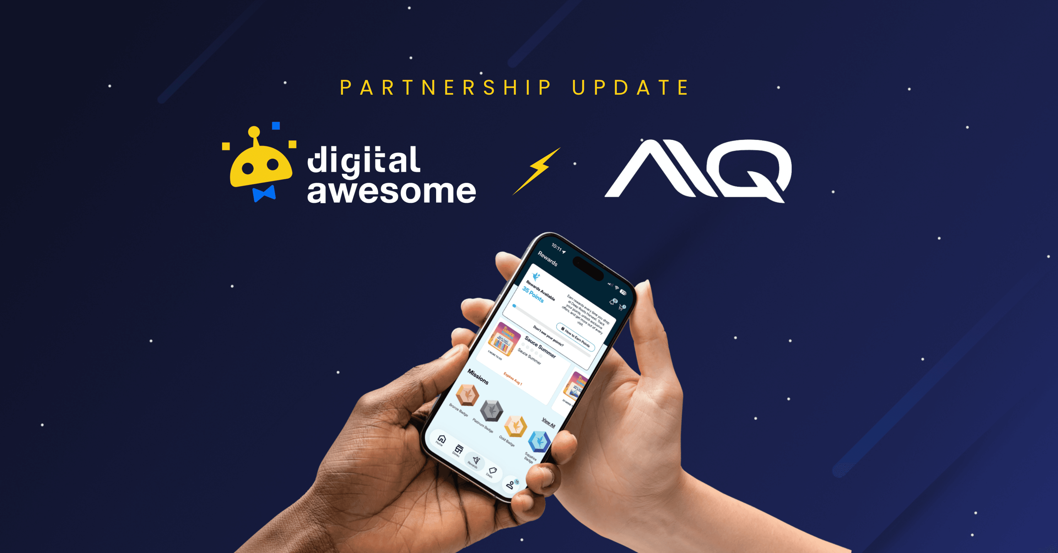
Digital Awesome Becomes Alpine IQ's Premium Mobile App Offering for Cannabis Retailers
What Dispensary App Features Should You Actually Demand? The Cannabis Mobile App Functionality Guide for Operators Who Are Done Guessing
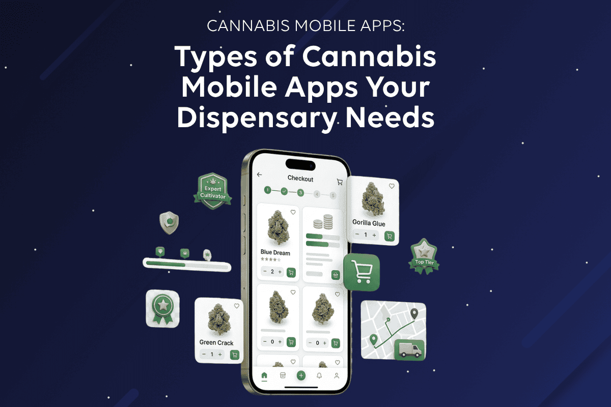
Types of Cannabis Mobile Apps Your Dispensary Business Needs — From a High-Converting Dispensary Ecommerce App to a Rewarding Cannabis Loyalty App and Weed Delivery App